Verify your color combinations meet accessibility standards with real-time contrast ratio calculations and compliance ratings.
Our professional tool helps designers and developers ensure their color combinations meet WCAG 2.1 accessibility standards for text readability.
Ensure text meets WCAG standards for all users
Test button, link, and form field contrast
Verify brand colors work accessibly together
Essential for web developers, UI designers, accessibility specialists, and anyone creating digital content that needs to meet accessibility standards.

Use the color picker or type values (HEX/RGB/HSL) for text and background colors.Click the 📋 button to copy any color value.

See how your color combination looks in real-time.The sample text updates automatically as you adjust colors.

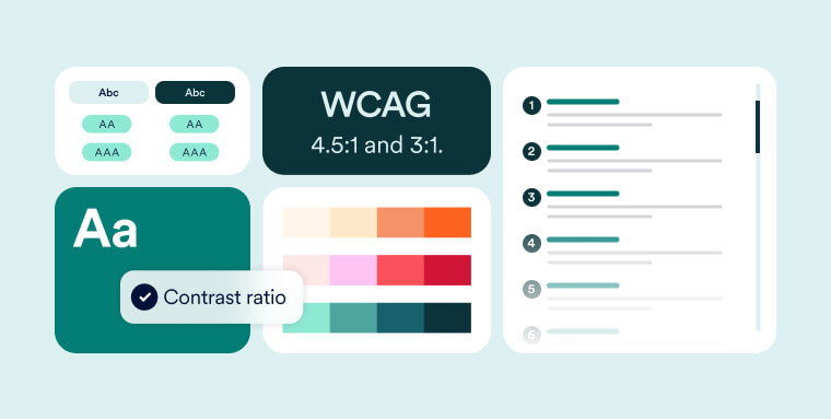
View the contrast ratio (e.g., 4.5:1).See WCAG compliance ratings (AA/AAA).Read the accessibility feedback message.

If contrast is too low, try darker/lighter variations.Use the copy feature to save compliant color combinations.
Test your color combinations for WCAG 2.1 compliance
Below are some common questions about using our online contrast checker tool.
WCAG 2.1 requires at least 4.5:1 for normal text (AA) and 7:1 for AAA compliance. Large text (18pt+) requires 3:1 for AA.
We support HEX (#FFFFFF), RGB (rgb(255,255,255)), and HSL (hsl(0,100%,100%)) color formats.
While we don't simulate color blindness, we do evaluate luminance contrast which is critical for all vision types.
Yes, the tool works for any elements requiring sufficient contrast, like icons or form controls.
Yes, meeting WCAG contrast ratios helps comply with ADA digital accessibility requirements.
Yes, our Contrast Checker is 100% free with no limitations or hidden costs.